Slack, the computer application we all now use to silently talk to our coworkers instead of emailing each other, decided it needed a new logo on Wednesday.
MORE CULTURE: Charles Bukowski’s old Fairmount bar is back on the market once more | M. Night Shyamalan talks living the American dream in Philly
The old logo was great, the company said in a blog post, but it only worked at certain angles, and it was so complicated (in involved 11 different colors!) that it was a headache for all involved.
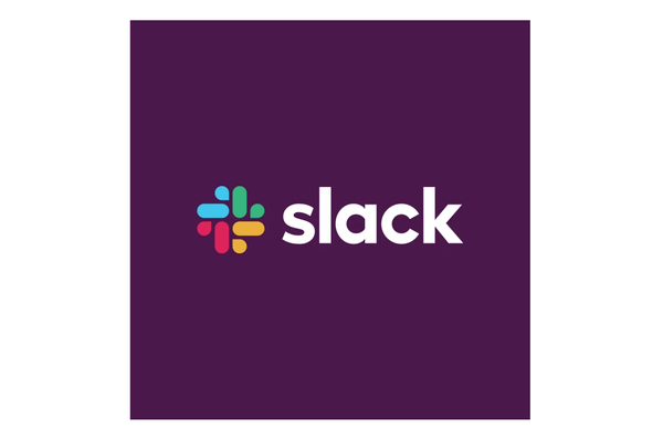
So Slack changed its logo to this:
It’s not offensive, and if we weren’t all used to the (now) old checkered Slack look it wouldn’t have ruffled any feathers. The way Slack is using the bits of the logo on its Twitter header, kind of like ice cream jimmies, is also fun:

Of course, everyone on the internet decided to weigh in on this Very Internet topic. We’ve rounded up some of the best and brightest takes on Slack’s logo, for your convenience:
In the end, it’s not bad and it actually might be good.
But it’s new, so everyone’s going to yell about it for a while.
Follow Adam & PhillyVoice on Twitter: @adamwhermann | @thePhillyVoice
Like us on Facebook: PhillyVoice
Add Adam's RSS feed to your feed reader
Have a news tip? Let us know.

