August 08, 2023
 Shamus Clancy/for PhillyVoice
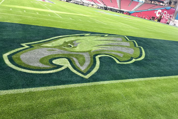
The Philadelphia Eagles' logo at State Farm Stadium ahead of Super Bowl LVII.
After Monday's team name rankings, I'm continuing on with my NFL aesthetics lists. I'm tackling team logos now. I am judging only off a team's primarily logo. As I write below, many teams could benefit from using an alternate or throwback logo instead of their primary, but they have no one to blame but themselves. I'll add a short review of each logo as well.
Let's get after it...
1. Raiders
Badass. I can hear the legendary NFL Films score in my head.
2. Buccaneers
It's intimidating with unique colors not used throughout the rest of the league. Even the scars of the 2002 NFC Championship Game can't keep this from a top-two spot.
3. Chargers
Simple. Great colors. Well done.
4. Bills
Love it. I just want to crush a dozen wings and shotgun at Labatt Blue after looking at this.
5. Bears
There's a strong legacy here, but their alternate logo with a literal bear would be No. 2 on my list.
6. Packers
So iconic that innumerable high school teams across the country have taken it as their own.
7. Broncos
Super late '90s, but in a good way, like "Dizzy Up the Girl" by the Goo Goo Dolls.
8. Ravens
I'm a fan of purple. It's underutilized in the sports world. The Ravens will do well in Wednesday's uniform rankings, too. Great aesthetics all around!
9. Texans
The most underrated logo in the league?
10. Seahawks
Sneakily very good!
11. Bengals
They should be using their bengal tiger alt logo instead of this, but it works.
12. Eagles
I'm a proponent of midnight green, but the old-school eagle logo is unquestionably better. The Eagles using wings on their helmets instead of this logo is a major win and will help them in my uniform rankings on Wednesday. Still, I like it!
13. Lions
14. Browns
From an on-field perspective, I dig the Browns not having a logo on their helmets. They doubled down on it with this logo. That wouldn't have been my choice. As is a common theme in this story, they have superior alternate logos, including that old-school elf and their Dawg Pound-themed one.
15. Titans
Hanging right around average. As a kid playing "Madden NFL 03" on PS1, I thought this was the coolest thing ever.
16. 49ers
There's a classic element here for sure for the team of the '80s, but I'd prefer a little bit more pizzazz!
17. Saints
The fleur-de-lis is a nice nod to New Orleans' French roots.
18. Patriots
This "Elvis" logo is synonymous with winning, but New England's old "Patriot Pat" logo easily clears this.
19. Steelers
Elite name that ranked No. 3 on my list from Monday, but a logo that's just "okay."
20. Vikings
That mustache is Fishtown level.
21. Jets
How about using an actual jet logo like the franchise did upon its inception or an understated jet design that was in use from the '70s through the '90s?
22. Giants
These New Jersey teams don't know what the hell they're doing.
23. Jaguars
Really '90s, but in a way that generates absolutely zero nostalgia. As a comparison in that light, it's the "Under the Table and Dreaming" of NFL logo.
24. Panthers
Bouncing off the Jags blurb, the 1995 expansion era is odd.
25. Falcons
Their '90s logo is infinitely better. Cleaner.
26. Rams
Identity crisis. They don't know what they want to do.
27. Cardinals
A bland, lifeless logo for a bland, lifeless organization.
28. Dolphins
Yet another team where an older logo is much better. Go back to the dolphin wearing a football helmet!
29. Colts
As I wrote in my team name rankings, this theme makes no sense for Indianapolis when its all tied to Baltimore's horse racing scene.
30. Cowboys
Boring and generic.
31. Chiefs
Oof.
32. Commanders
Follow Shamus & PhillyVoice on Twitter: @shamus_clancy | @thePhillyVoice
Like us on Facebook: PhillyVoice Sports
Add Shamus' RSS feed to your feed reader
