August 05, 2015
 Jerry Kuyper Partners/Penn State University
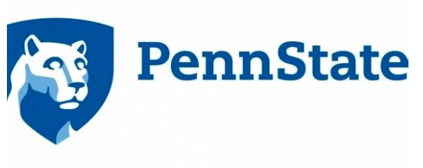
New academic logo for Penn State University.
With all of the negative news surrounding lions of late, it's reassuring to see that Penn State's Nittany lion is smiling after the university unveiled an update to its academic logo.
According to The Daily Collegian, Penn State decided to "refresh" its look for the first time since the 1980s because the old logo, depicting a lion shrine with the year "1855" underneath it, did not reproduce well on the web, social media and video.
To be clear, the redesign will not replace the university seal or the athletic logo. It will instead be used on university documents such as college applications and academic materials. The university clarified that the change is a refresh, not a rebrand.
That refresh will cost Penn State $128,000, to be paid to identity consulting firm Jerry Kuyper Partners.
“I am excited to see us moving forward with an updated visual identity that connects our rich tradition with a bright future,” Penn State President Eric Barron said in a university press release. “The 1980s version of the mark incorporated important elements of who we are as a University, but had presented usage challenges for some time. The updated version is a strong representation of Penn Staters’ excellence, passion and innovation.”
Now that the logo reproduces so well on the web, the backlash has been fierce. A change.org petition launched on Tuesday already has 1,021 supporters seeking a redesign of the refresh.
We understand not everyone will agree on a new design, however, it is unacceptable that the University spent $128,000 while never asking the public opinions of the two most important groups--the students and alumni. We ask that the logo is redesigned to better represent our traditional logo and the students and alumni are offered the opportunity to cast our vote.
Reactions on Twitter have compared the new lion to a zombie.
Penn State updated its shield logo...does anyone else think it looks like a Zombie? pic.twitter.com/ZC8vCqaR2d
— Amber (@QBsAndCupcakes) August 4, 2015
Settle down everyone, obviously @penn_state is trying to cash in on the zombie craze with it's new logo. Genius!
— Rich O'Donald (@akadicko17) August 4, 2015
But you really have to ask yourself, would a zombie be smirking like that? If so, why?
Others chose to experiment with fixing the logo themselves, coming up with the following alterations.
tweaked #pennstate's new logo in this sloppy rough draft. I think it looks better already. pic.twitter.com/q3miL8kYqY
— Spencer (@spendude) August 5, 2015
I fixed the new @penn_state logo so it doesn't look so stupid. #muchsmarter pic.twitter.com/O6VaU8xQRg
— Rich O'Donald (@akadicko17) August 5, 2015
As of Wednesday evening, there was no indication from the university that it plans to adjust the new logo. Jerry Kuyper Partners has also created brand designs for Cisco, Cigna, PennMedicine, World Wildlife Fund and AT&T.
