While the Sixers lost a whole bunch of games over the past four seasons, they have done a good job of building a strong infrastructure. A small, but noticeable part of that process (sorry) has been revamping the team’s on-court look, and well, the look of the court. As Desus and Mero say, the Sixers’ brand is strong.
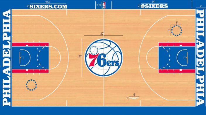
Here is the most recent court design at Wells Fargo Center, which was updated before the 2015-16 season:

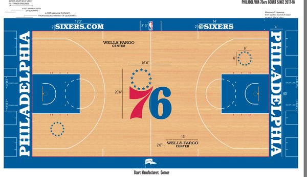
On Tuesday, Sixers chief sales and marketing officer Chris Heck tweeted out what appears to be an updated court design. You know, especially because it says “Philadelphia 76ers Court Since 2017-18” at the top:
This update feels like an improvement on an already solid design, classic and clean. If Zach Lowe does the court design rankings again, maybe the Sixers will move up from sixth. Ditching the red paint outside of the lane and going back to the original logo from 1963-1977 at center court are both nice touches.
But again, this was already a pretty good product. You know what wasn’t? This.
And this.
I will always cherish those Allen Iverson years, but man, the Sixers looked pretty terrible in retrospect. Sorry, I just needed to get that off my chest.
Follow Rich on Twitter: @rich_hofmann
Like the new PhillyVoice Sports page on Facebook

