
April 13, 2017
Earlier this week, Major League Baseball revealed the alternate uniforms for all six of their special occasions this season: Mother's Day, Memorial Day, Father's Day, 4th of July (Stars and Stripes), the Home Run Derby, and the MLB All-Star Game.
And for Phillies fans looking to pick up a new cap for the summer, there are some new options coming their way.
Over at sportslogos.net, Chris Creamer put together a great recap broken down by event and by team; I highly recommend checking it out.
Here's a look at what the Phillies will be rocking this season:
As expected, some are better than others, but there's more good than bad. And one thing is clear: nearly all of them are vast improvements over their 2016 counterparts.
So in an effort to help make sure you don't buy the wrong hat – and trust me, if you're an adult, any jersey you buy is the wrong jersey, so we'll stick with the caps – let's rank the six you see above, starting with the worst.
[NOTE: Because I'm no style expert, I've decided to give my better (and more fashion-forward) half, Sydney, a chance to weigh in on each. We certainly disagreed on a few.]
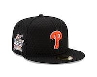
The good news here is that it won't be worn for an actual game – that, and the Phillies aren't likely to have anyone in the Home Run Derby anyway.
SYD'S TAKE: "No. Just no. Is this a Flyers hat?"
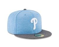
As for this University of North Carolina Father's Day cap, it's just a little too much blue. But, hey, at least it more or less matches the rest of the uniform.
SYD'S TAKE: "I'm going to let Jack Donaghy explain this one for me..."
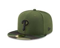
That being said, it's a huge improvement over last year, and if you're a military veteran – or at least can pull off the camo look – then this cap seems like a no-brainer. And who knows, next year they could go back to that monstrosity you see Freddy Galvis wearing in the photo at the top of this post.
SYD'S TAKE: "No civilian has been able to pull off camo since the Destiny's Child "Survivor" video. Just remember that."
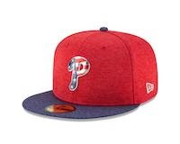
The heather blue they used on the brim, which is the main color on some other teams' caps, is absolutely gorgeous. They at least got it on the brim, but just take a look at the Braves' version and tell me you wouldn't want to see that with a Phillies logo instead.
SYD'S TAKE: "This would've been by No. 2 pick, because unlike Matt, I love America."
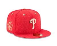
The real saving grace of this cap is the color. It's a heather red, similar to the Independence Day hat. Sure, I just got over saying how pretty the heather blue was, but I don't see that anywhere on this cap, so I'm going to judge it on its own merits. And I like the one-color heather over the two-tone, and even though it's gold, I prefer the solid Phillies logo to the American Flag overlay.
SYD'S TAKE: "You can only successfully pull this off if you have a grill. Gold has its place, but not on athletic wear."
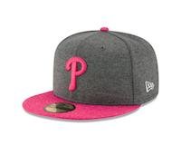
The dark gray with the bright pink, it just works.
SYD'S TAKE: "This is definitely one of my top picks. As a longtime lover of pink, I tend to appreciate a man who can pull off wearing that color. Plus, it's not too much pink, especially with the heather gray to tone it down."
(I can pull off pink.)
Follow Matt on Twitter: @matt_mullin
Like our new PhillyVoice Sports Facebook page.